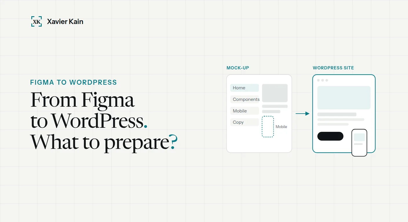
A Figma design is faithfully built in WordPress when it comes with four things: mobile versions of the screens, named styles and components, the real content, and a list of what the client will edit themselves. Without them, the developer guesses, and that is where the site drifts from the design.
This guide is for designers, agencies and businesses that already have a design and are looking for someone to turn it into a website. It lists what to prepare, and what each omission costs in back-and-forth.
The checklist to prepare before development.
| Provide | Why | If it is missing |
|---|---|---|
| Mobile version of key screens | Most visits happen on a phone | The developer invents the mobile layout |
| Named text styles and colours | They become the site's global settings | Dozens of similar sizes, hard to maintain |
| Reusable components | Cards, buttons and blocks are reused without being redrawn | Every page is built as a one-off |
| Real content | Real texts are rarely the length of placeholder text | Layouts that break at launch |
| Interactive states | Hover, form errors, open menu | Behaviour decided at random |
| Fonts with a web licence | A font bought for print does not always cover the web | Font replaced at the last minute |
| List of editable content | It decides how pages are built in WordPress | A beautiful site nobody dares to touch |
The mobile version is not optional.
It is the most common gap: a design polished in every detail on a large screen, and nothing for the phone. Yet that is the version most visitors will see. Without a mobile screen, the developer has to decide alone the order of blocks, the size of headings and where the menu goes.
You do not need every page in three sizes. The key screens are enough, the home page, one template page and the form, provided the components are designed to adapt.
Styles and components: what makes the site maintainable.
In Figma, a well-prepared design names its text styles, colours and components. During development those names become the site's global settings: changing the main colour or the heading size then happens in one place, for the whole site.
Figma's Dev Mode makes the developer's job easier by exposing measurements, colours and spacing. It does not replace a clear structure: a file where every button is drawn differently still takes long to build, however well it is inspected.
Decide what the client will edit themselves.
This is the question that changes the build the most. A home page text that will never move can be fixed. A list of services, news or product pages must be easy to edit from the admin, without touching the layout.
- Template pages: article, service, case study. Built once, then filled in.
- Reusable blocks: testimonials, key figures, calls to action, placed wherever needed.
- Locked areas: header, footer, elements only the developer changes.
Elementor or the block editor?
Both allow a faithful build. Elementor gives the client a lot of layout freedom; WordPress's native block editor produces lighter, more guided pages. The choice mostly depends on what the client wants to change alone.
Performance and SEO are also decided in the design.
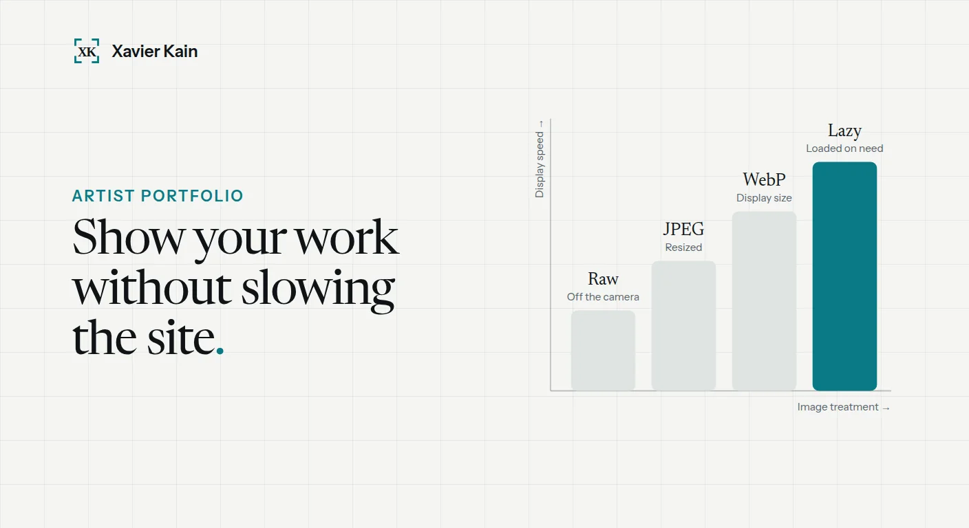
A full-screen video on the home page, animations on every scroll or huge images are design choices that weigh on speed. Spotting them before development lets you plan alternatives: a still image on mobile, modern formats, lazy loading.
For SEO, the design should show a single main heading per page and a logical hierarchy of subheadings. If the site replaces an existing one, the URL and redirect plan is prepared at the same time: see when and how to redesign a website.
Designs built in real projects.
A real example
I built in WordPress the designs of Homa Games, the EDF Ombudsman, Ridemaster and Yespark. In each case, the time saved came less from the tool than from how the file was prepared: named components and mobile screens supplied from the start.
To have your design built, see Figma and Adobe XD to WordPress development.
FAQ — Turning a design into WordPress.
Can an Adobe XD design be built like a Figma design?
Yes. The principle is the same: screens, styles, components and content. The developer just needs access to the file or a share link with measurements and exportable assets.
Do all pages need a mobile version?
No. Key screens are enough, such as the home page, a template page and the form, provided the components are designed to adapt. The developer then derives the other pages from these models.
Will the client be able to edit the site afterwards?
Yes, if it was planned. That is why the list of editable content should be decided before development: it determines how pages are built in WordPress.
Sources.
- Figma — Guide to Dev Mode — inspecting a design for development
- WordPress — Block Editor Handbook — building pages and blocks
- web.dev — Responsive images — image weight and performance